Understanding Growing Inequality, Part 1 - The Rich Get Richer, The Poor Get the Picture
Understanding just how extreme the differences in income and property ownership have become in Canada starts with realistic measurements.
Part 1 -
The Canadian Centre for Policy Alternatives, a left-ish think Canadian tank has started a New Year’s tradition of announcing the gap between “average” Canadian pay and the highest paid CEOs in Canada, which points out that some CEO’s who start work on January 2 will make more before noon the next day - 9:27 am on January 3, 2024, to be exact, than the average worker makes all year.
According to CCPA’s data, the top CEOs make $7,162 an hour, which means it takes little over eight hours for them to make $60,607 — the annual pay of the average worker in Canada.
“If we say that both (CEOs and workers) get paid vacations, like New Year’s Day, then by Tuesday, January 2, 2024, at 9:27 a.m. those CEOs will have already gotten what the average worker makes in a year,” CCPA Senior Economist and author of the report David Macdonald said in a statement.
It’s worth pointing out that this is “New Year’s” tradition has been going on for some years now.
“the think tank’s data series that began in 2008, with an average pay of $14.9 million. That’s 246 times the average worker’s pay in Canada, up from 241 times in 2021, when the average was $14.3 million.”
That multiple - 246 times the average workers’ pay - has more than doubled in the last 25+ years. In 1998, the Top CEOs were paid 105 times the average wage, while in 2012, the richest CEO’s earned 189 times the salary of the average worker.
Inequality has been growing in Canada since the 1970s. There are people whose incomes have stalled for more than a generation.
Canada - in 2013, economist Miles Corak wrote “The typical [Canadian] household is now no better off, indeed about $3,000 worse off, than it was in the mid to late 1970s, in spite of 35 years of economic growth.”
Alberta - In 2013, at the height of an oil boom in Alberta, an economist working for the City of Edmonton said that, adjusted for inflation, 99% of the residents of that city had seen no increase in their wages in 30 years.
Despite performing better economically than some other provinces, the province of Manitoba - consistently has some of the deepest poverty in the country. In 2020, a report showed that in Manitoba:
1 out of every 6 children living in a two-parent family live in poverty,
1 out of every 1.6 children living in a single parent family lives in poverty
In 2018, there was an increase of 7% in overall poverty and 19% increase in child poverty. The report demonstrates that at this rate it will take 697.5 years to end child poverty in Manitoba.
Morality, Riches and Poverty
Political debates immediately turn this into a question of whether people “deserve” their pay. High pay is usually justified based on the “rare” virtues and qualities of individuals who are highly paid, but it is just as common for people living in poverty to be blamed for their own fate.
It’s been said that “poverty is the greatest censor”, and people living in poverty in many societies are treated as if they are despised.
In a very real sense, people equate material wealth and success as a “reward”, presumably for good behaviour, and poverty as “punishment” for bad behaviour - criminality, moral weakness, or laziness.
The premise of this idea is borne out by various self-help and other advice for living. There’s the idea that all people have to do is work hard and do the right thing to get ahead. There’s another that people who blame the world for their lack of success are whiners. Criticism of the greed of plutocrats and oligarchs is shrugged off as envy of their “betters”.
We are also inundated with the “secrets to success” and advice from living from billionaires, as if all people have to do is follow that advice, and they, too, will have the same success.
This morality - of virtuous power and corrupted poverty - is blatant in our politics and our policy, with a simple assumption - that people who are succeeded must be doing something right, while people who are losing must be doing something wrong.
This is one of the reasons programs for people in poverty are attacked, and when you propose income supports, people will oppose it, arguing recipients will waste the funds, on alcohol or drugs, because it is assumed that they are “bad people.” In a very real sense, people living in poverty are treated as if they have done something wrong, that needs to be corrected - like prisoners who have committed a crime, in order to punish people out of poverty, sometimes in ways that are quite sadistic and incredibly intrusive. It’s why politicians have pushed for and passed drug testing requirements for people on welfare in some U.S. jurisdictions, like Florida.
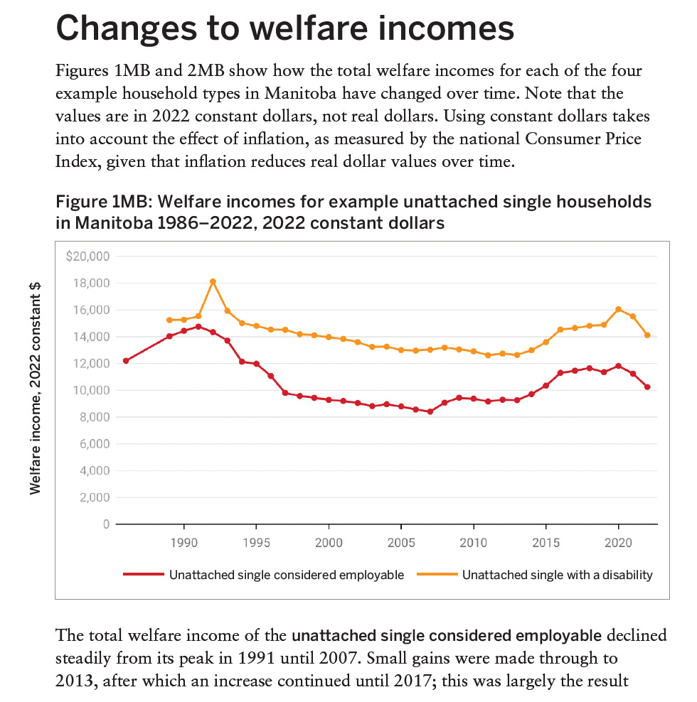
Punishing people out of poverty is the model for social assistance in Manitoba. In 1992, the Manitoba Government rolled EIA rates back to 1986 levels and froze them there, where they remain. After 38 years, the rates are so low that it is virtually impossible to pay rent and eat. Individuals were expected to continually search for a job, despite not being able to afford a phone or bus pass.
For anyone hoping to supplement their income, and pay for a bus pas, phone, or groceries, up until 2022, Manitoba EIA applicants and recipients faced strict limits on what they can earn per month.
For applicants, they can earn $200 per month. Whatever they earn beyond that is deducted “dollar-for-dollar” which is equivalent to a tax rate of 100%.
For recipients, “the first $200 of net earnings is exempt; a 30% exemption applies thereafter” - which is to say, equivalent to a tax rate of 70% that kicks in when
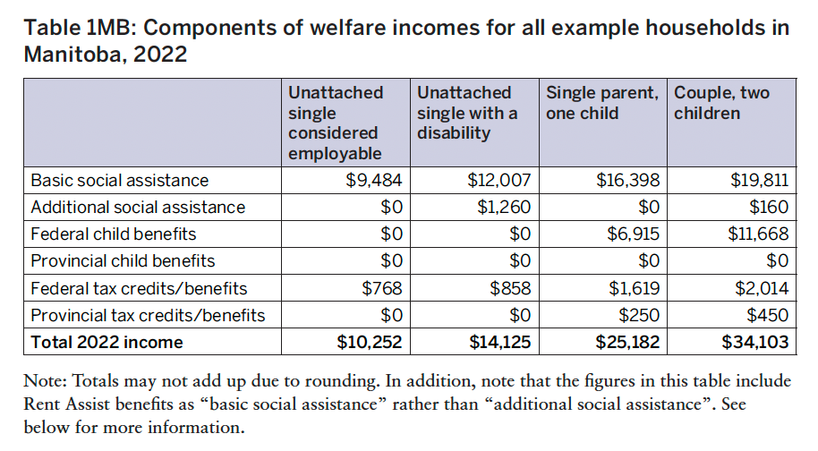
That means that for single people on EIA, if they earn $2,400 a year over their $10,252 - a total of $12,652, they will face a 70% clawback of that income. If they earn much more, they will be kicked off the program entirely.
Note that the rate for people with a disability is if they are “unattached single”. That is because if they are married, their spouse is expected to support them. If their spouse becomes disabled - through a degenerative disease, or multiple sclerosis, or a brain injury, it creates an incredible financial burden, that drives couples to divorce.
The totals are also very significantly boosted by federal contributions.
(From https://maytree.com/publications/welfare-in-canada-2022-now-available/)
At some points in the last ten years, more than 70,000 of the 1.4-million people who live in Manitoba live on provincial social assistance.
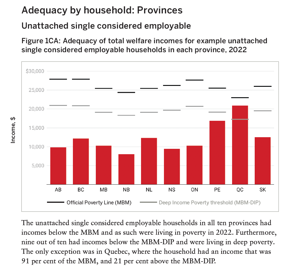
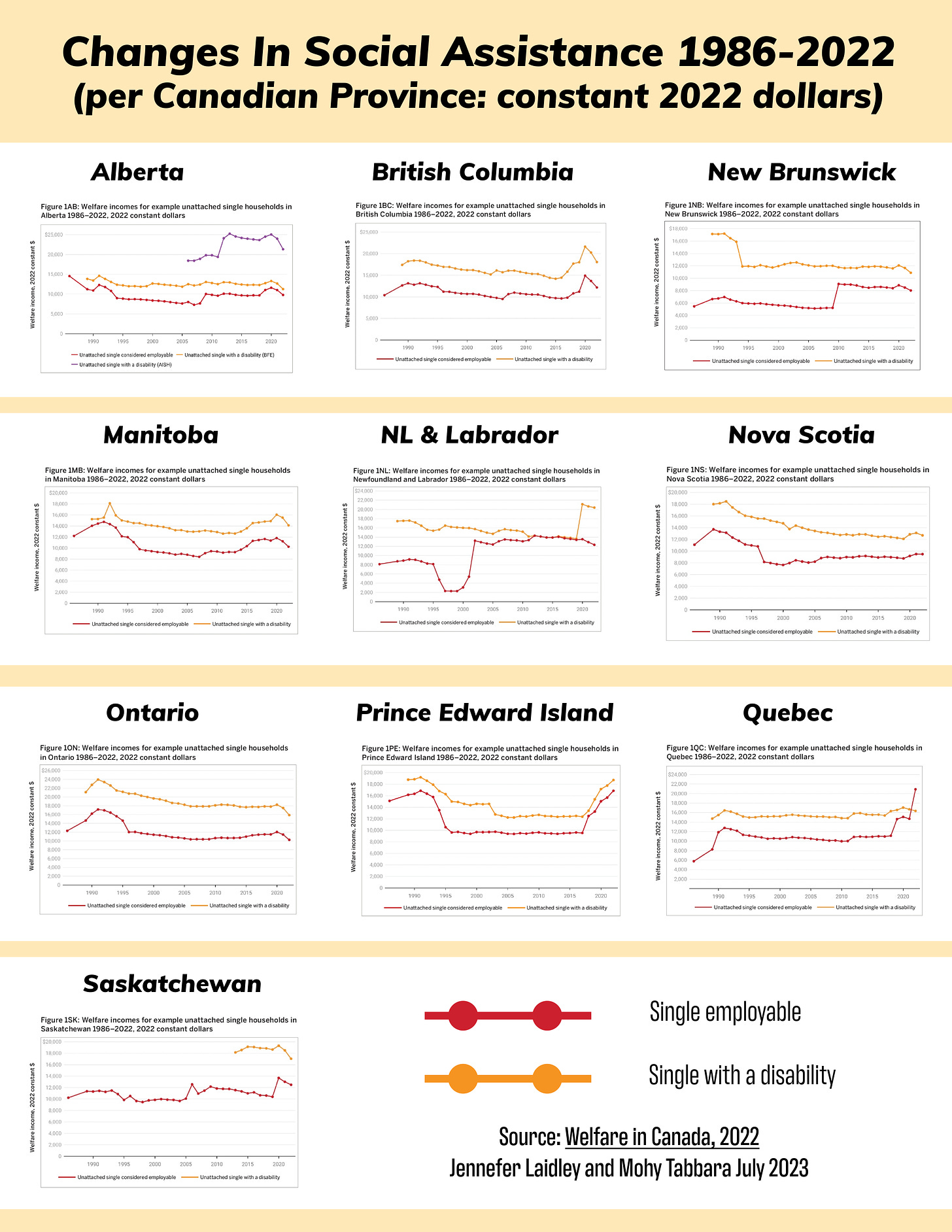
Manitoba is not alone - many other provinces in Canada have seen provincial income supports for people in need drop over the last 38 years, and in all provinces except Quebec, it leaves people living in deep poverty.
This is important. “Welfare” or social assistance payments - are a form of social insurance - so that if you can’t work, you can still pay your bills. When we talk about “social safety nets” it’s the idea that there is something there to catch you when jobs and other supports fail. From a policy point of view, they are “automatic” stabilizers for the whole economy. When those “stabilizers” in Canada are not been updated for nearly 40 years, it results in chronic, crisis levels of poverty.
https://maytree.com/publications/welfare-in-canada-2022-now-available/
The 2017 Manitoba Child and Family Report Card reported that
“in Manitoba for a single parent Employment and Income Assistance recipient with a two-year-old child, welfare income in constant 2015 dollars was lower in 2015 at $17,103 than it was in 1986 ($17,225).
Similarly, the welfare income for a couple with two children ($24,719) was nearly $2,400 lower than what they received in 1986.”
Why Real-World differences in income Inequality are worse than we perceive
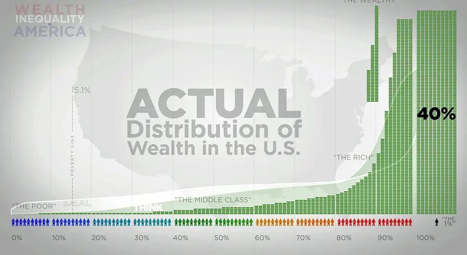
There is a real problem with the way we think about income inequality, because the actual differences in wealth and income are so great it can be a challenge even to imagine, or even picture on a graph or diagram.
What we’re talking about is the “distribution” of income - how money and wealth is distributed in the first place. It’s important to recognize that, among orthodox, mainstream economists, that there is a taboo to discussing distribution.
Robert Lucas, who is one of the major architects of the neoclassical economic revolution of the 1970s is on the record as saying :
“nothing [is] as poisonous” to sound economics as “to focus on questions of distribution.”
For someone of Lucas’ stature to make that claim is pretty incredible - it is effectively a ban on discussing both the generation of wealth and the existence of poverty.
As I wrote elsewhere, the concentration of wealth and income tend to accumulate based on a “power law”. The first person to recognize this was Vilfredo Pareto, an Italian engineer and sociologist, who “discovered” the 80/20 law, where 20% of the population earns 80% of the income or, 20% of the property.
The thing about the 80/20 rule is that it is recursive: it applies to itself - so if you take the incomes and property within the top 20% of the population, it also gets divided up by the same rule - and so on, and so on.
This is where we get talk of the “1%”- when the concentration of income and wealth is actually even greater in the 0.1%.
0.1% of the population owns 40%.
0.64% of the population owns 11%
3.2% of the population owns 13%
16% of the population owns 16%
80% of the population has 20%
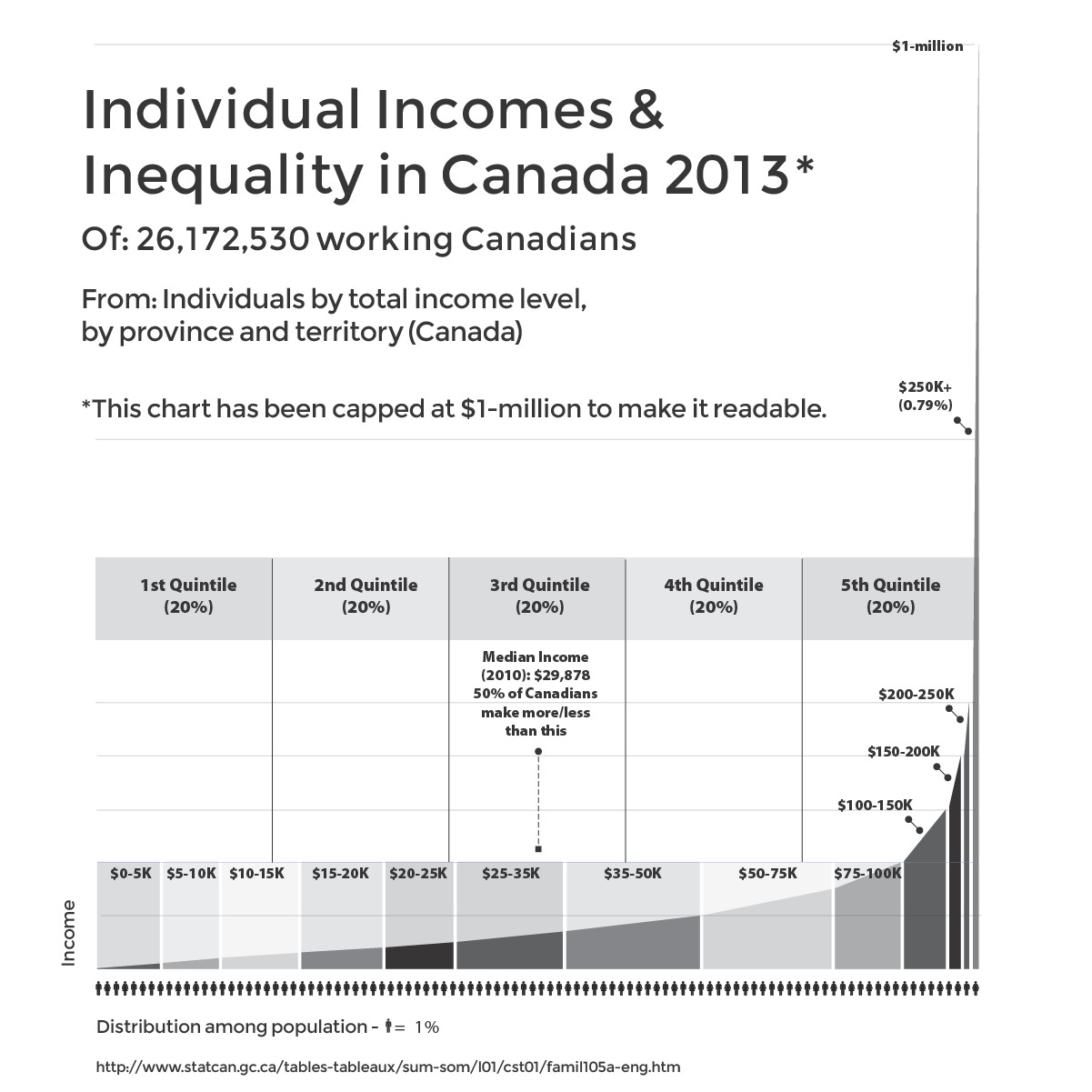
The result is a graph that looks something like this. For readability, this chart has been capped at $1-million - but there are people who in 2013 made tens millions of dollars.
It’s why looking for a single number to try to cover what are huge disparities in what people earn, and what people own, is really inadequate.
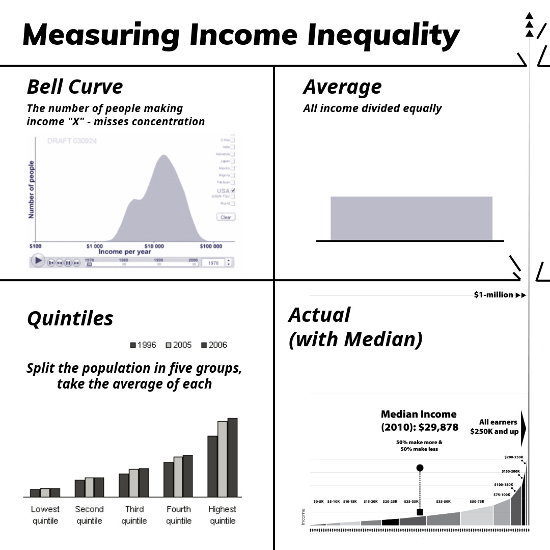
Because the distribution of wealth tends to follow a “power law,” the curves that income and wealth inequality mean that using bell curves, quintiles medians and averages are all inadequate to the task of describing the differences in concentration of ownership and the breadth of inequality.
This chart shows why:
The Bell Curve
In the above chart, the bell curve is supposed to show the distribution of income in the U.S. in 1970, but it doesn’t. This is the kind of chart that appears to show that most income is earned by the “middle class”, because the horizontal X-axis shows income. But it does not show concentration of income - it shows incomes, and the Y-axis shows the number of people earning.
The (non-existent) Average
“Average” is one of the most misleading terms used to deceive people about the economy, income, distribution and especially taxes and tax cuts. It takes the entire economy, and just divides it up as if everyone has exactly the same job and pays the same taxes. This is exactly what the Fraser Institute, a Canadian libertarian propaganda shop which puts out highly publicized reports on taxes and economic freedom.
The irony is that the Fraser Institute’s assumptions of “average” have the effect of creating a political fiction.
Neither Canadian governments nor the private sector do what the Fraser Institute does, mathematically, which is to imagine a country where all income and taxes, including corporate taxes, are divided equally among the population. The Fraser Institute pretends that Canada is an egalitarian socialist paradise with total redistribution of income. It is not.
Politicians (following spin doctors) routinely distort the truth and the benefits that an “average” taxpayer will save thousands from a tax cut. Because income and wealth are concentrated at the top, so is tax revenue - so do the benefits from tax cuts.
Quintiles: Five Averages that still mislead
Quintiles just means splitting up the population into five groups of 20% each, and then taking the average of each group.
This ignores that under an 80/20 or a similar power law, the top 20% will have 80% of the income and 80% of the property. It especially has the effect of making most of the people in the top 20% appear to have more money, while making the very richest seem to have much less.
Quintiles are often used to measure social mobility, with people progressing from one quintile upwards being seen as a positive indicator.
From the poorest person in the lowest quintile, with annual income of zero, the person with the highest income in the fourth quintile, there may be a difference of less than $100,000.
Within the top 20% - and the top 1%, the differences from the lowest income to the highest is in the tens of millions of dollars.
Actual Distribution: the Power Law and a Steep, Steep Curve
This chart has the median placed on it - in part to show that it is not a useful measure. Median is the income midpoint - 50% of people make more, 50% of people make less. It doesn’t tell you anything about concentrations of income.
The actual distribution of income as shown on the figure above has people representing 1% of the population along the X-axis, and dollars in annual income along the Y-axis.
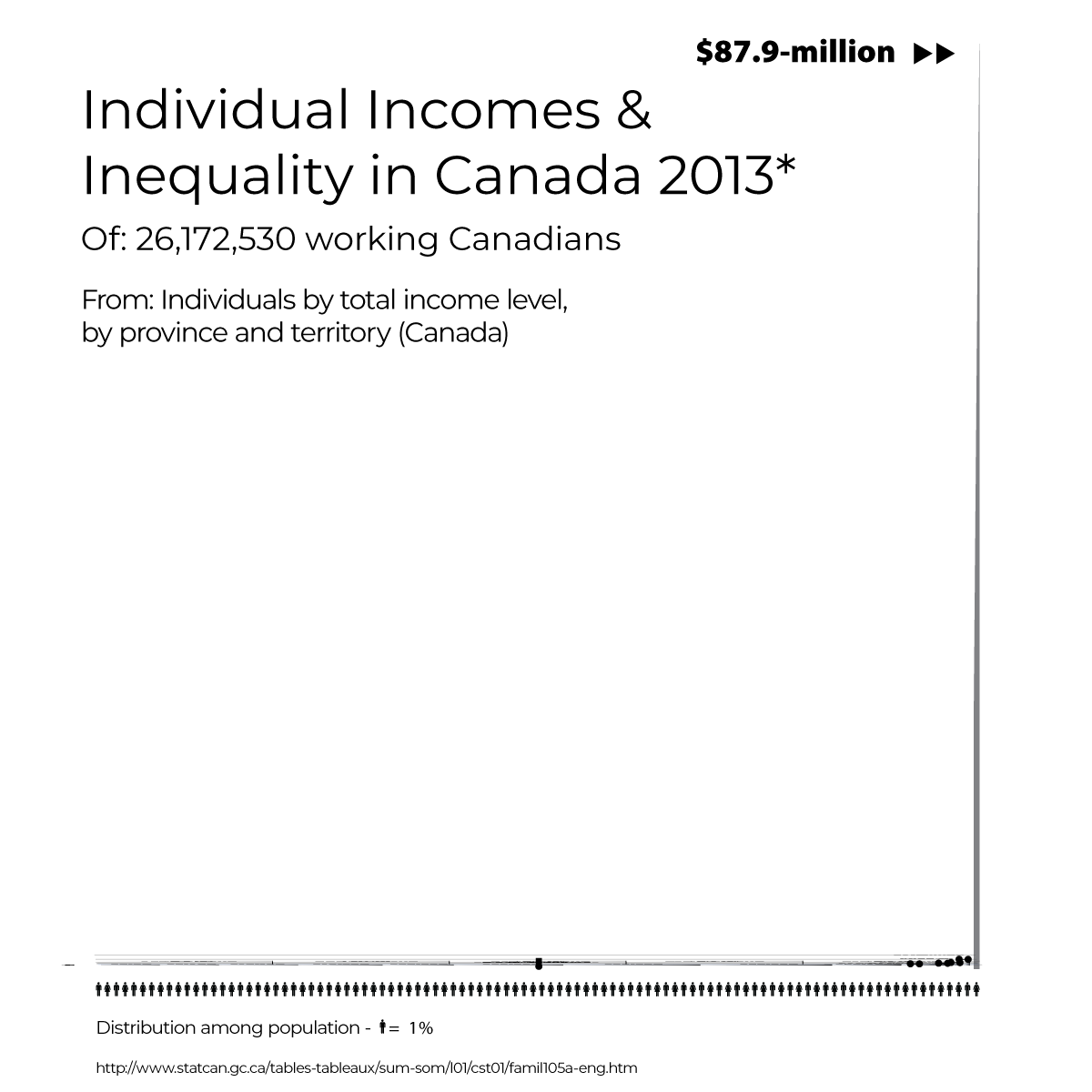
The chart above shows the difficulty of illustrating the disparity. In 2013, the top earning CEO in Canada was ONEX boss Gerry Schwarz, who earned $87.9-million. The chart would have to be 90 times as high to fit in his salary. Adjusting the chart to fit in all earners looks like this:
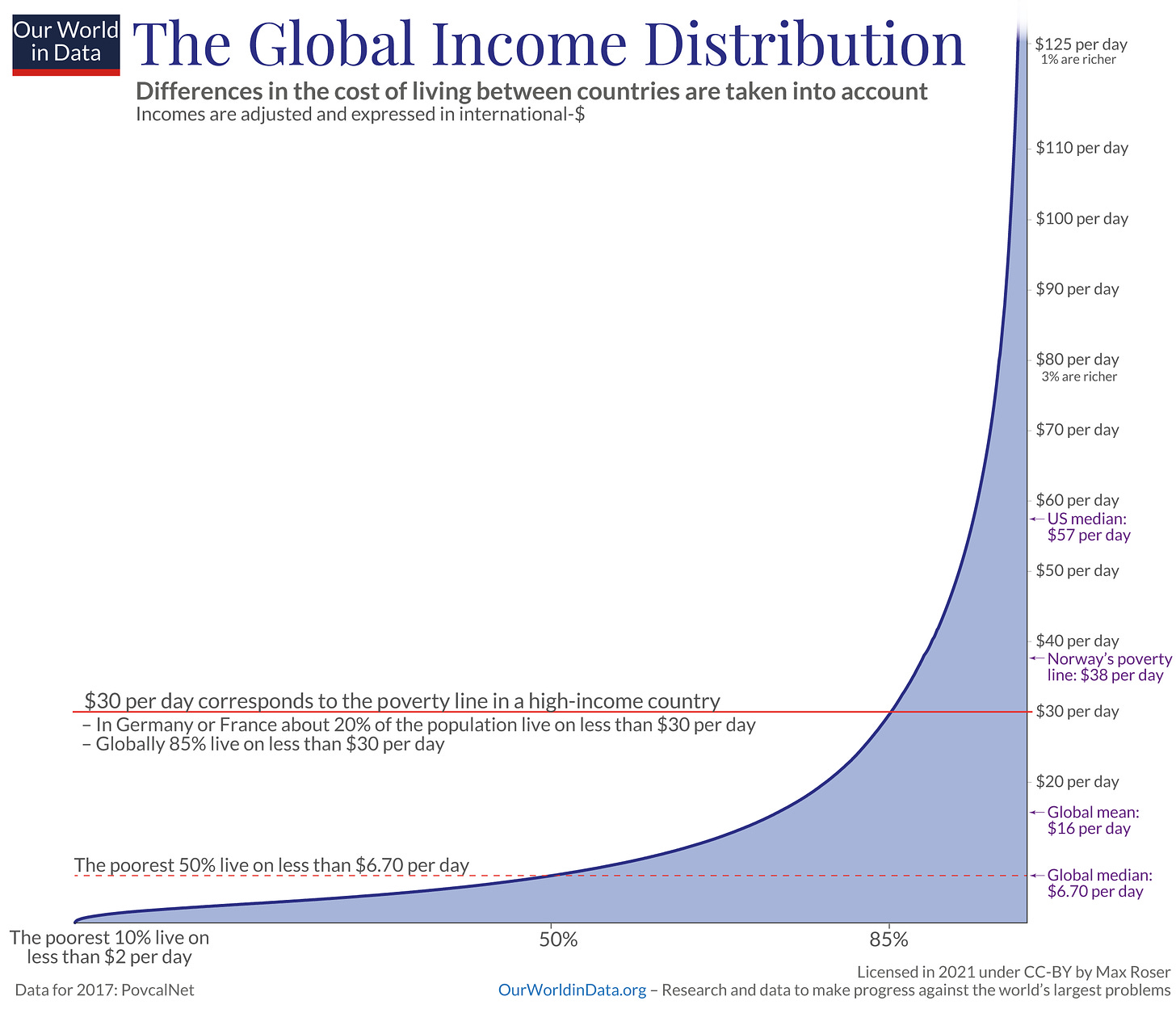
This chart also shows that the same kind of income distribution applies on a worldwide basis.
While this distribution of income and wealth has been seen as something “natural” - Vilfredo Pareto, the Italian mathematician and economist dubbed “the theoretician of totalitarianism” said it was “something in the nature of man” - when it is something in the nature of our social arrangements - which are cultural, not natural.
End of Part 1
-30-
COMING UP
Part 2 - How the Rich Got that Way - Finance and inequality, especially since 1978


